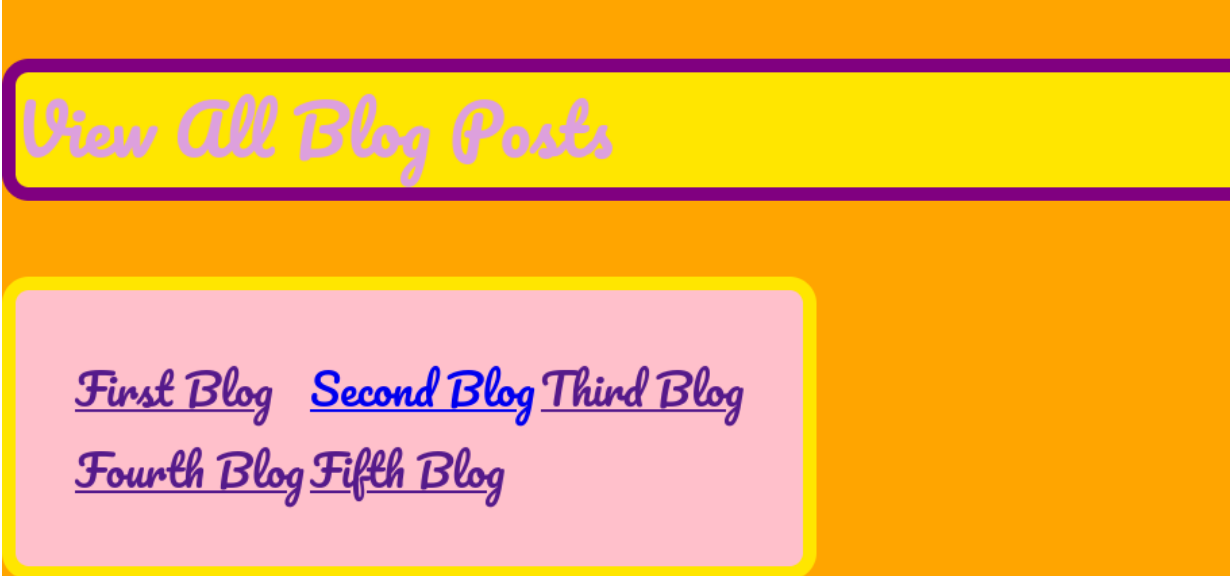
So, first of all, here is a screenshot of a table on my blog homepage, currently with zero positioning changes made to it:
There are many ways to position elements in web design, and it is super important to understand the difference between the following:
Unlike with Photoshop or Word or Paint or any other kind of editor you might be used to, you can’t just click and drag elements on your webpage when using CSS. Instead, you have to tell your code editor which TYPE of position you want and then define HOW.
So, first of all, here is a screenshot of a table on my blog homepage, currently with zero positioning changes made to it:

And here is the CSS used in its design:
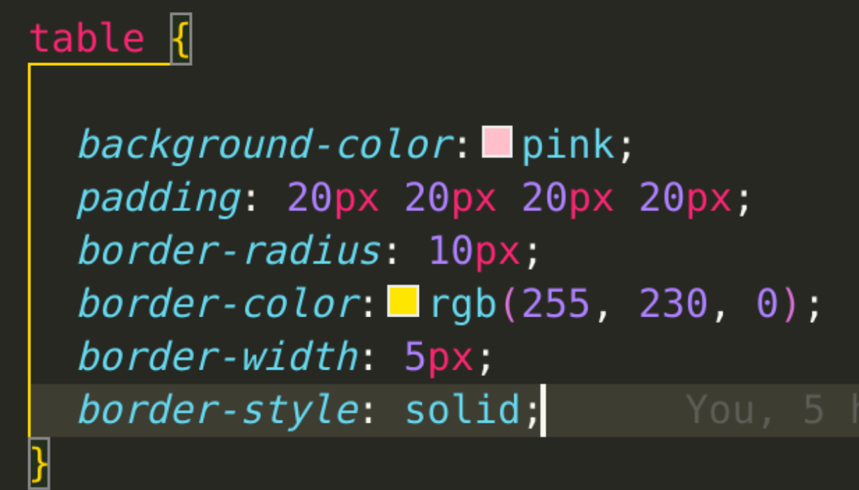
You can see that the only CSS I have done to the blog has been to do with its colour, padding, and border. So what happens when you get into the Positioning Realm?
Relative positioning allows you to move an element from where it is currently. So the “relative” is not about other elements - the element is relative to itself. If I were to add “position: relative” to the CSS code above without specifying a positioning attribute, nothing would happen. But when I add “left: 15px” as well, this is what happens:

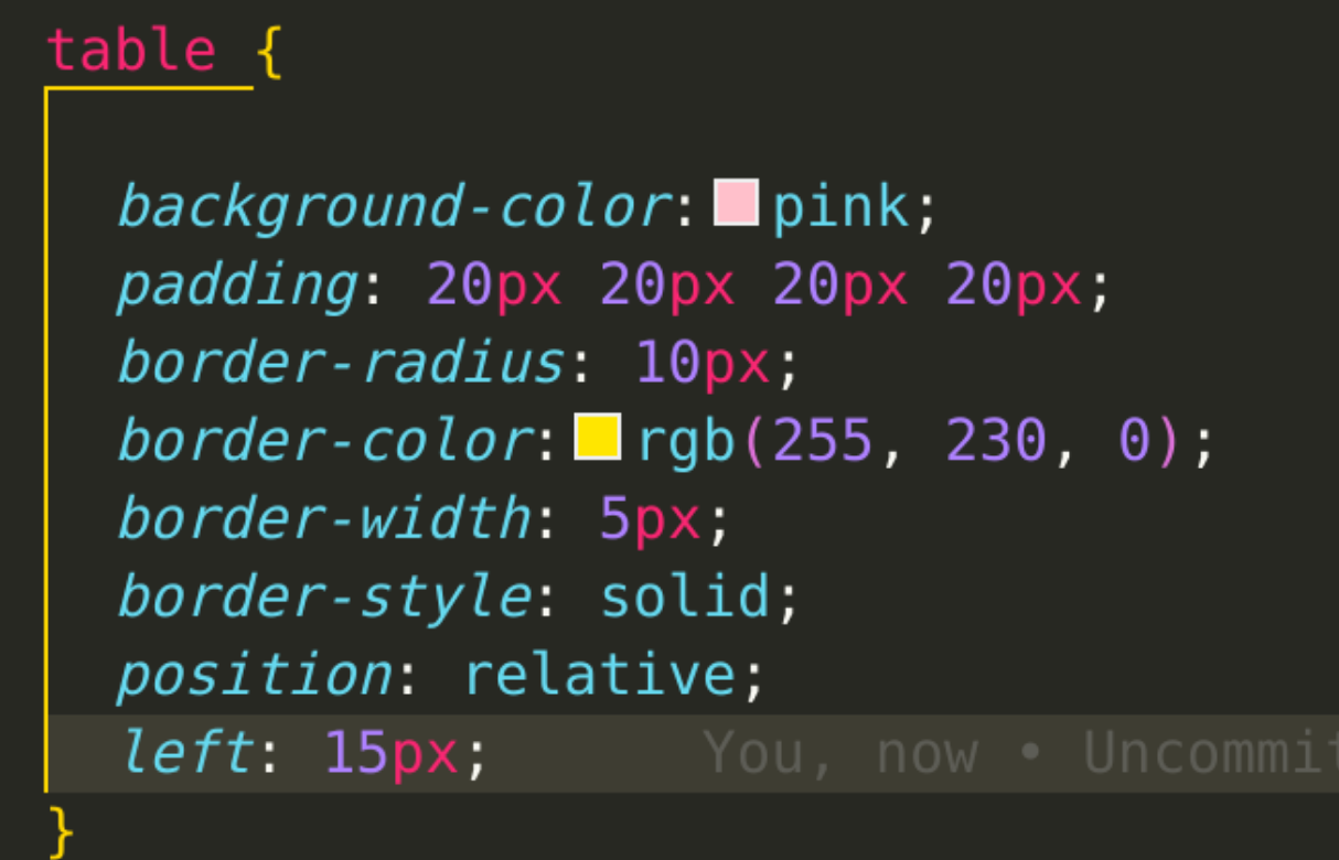
The table has moved 15 pixels from the left, relative to where it was sitting before.
Absolute positioning lets you put any page element anywhere, setting its location using the top, right, bottom, and left positioning attributes. Whatever values you put in will be relative to whatever parent element of your element that has relative or absolute positioning. If there is no parent element with relative or absolute positioning, the element you are working with will place itself relative to the whole HTML page.
The main thing you need to know is that when you use absolute positioning on an element, it will remove it from the flow of the page. That means it stops affecting other elements and other elements stop affecting it. When I changed the above code from “relative” to “absolute”, nothing obvious happened. Then, since the table is mashed against the bottom of the page, I added “bottom: 15px;” to see what would happen, and this is the result:
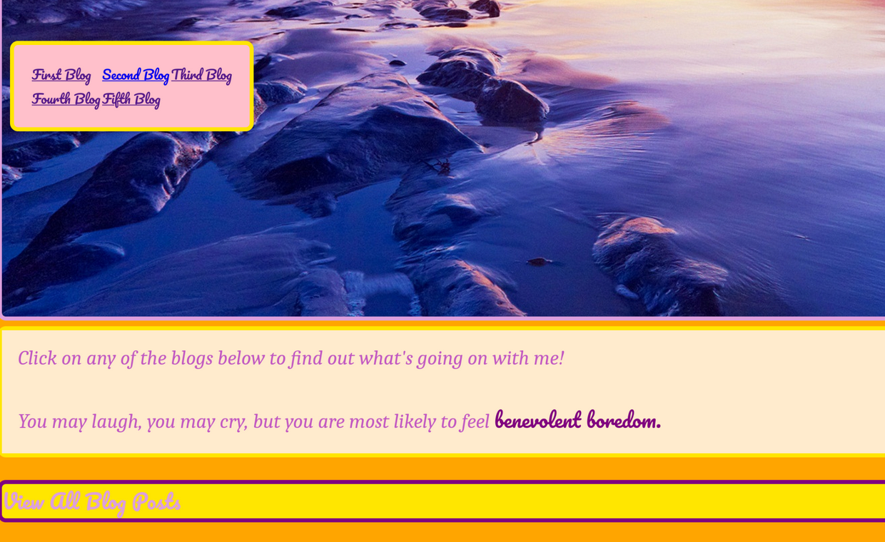
It went flying up above the image! So instead I thought absolute positioning might be better suited for another element on the page. I made a new class for my homepage title and using absolute positioning, it went from looking like this:

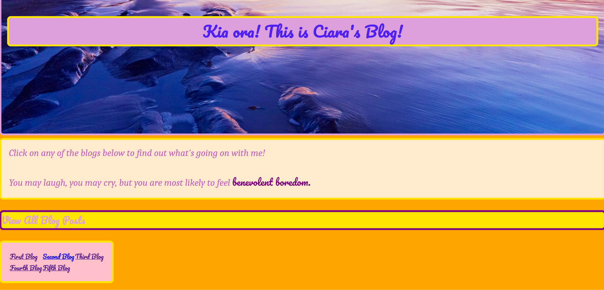
To this:

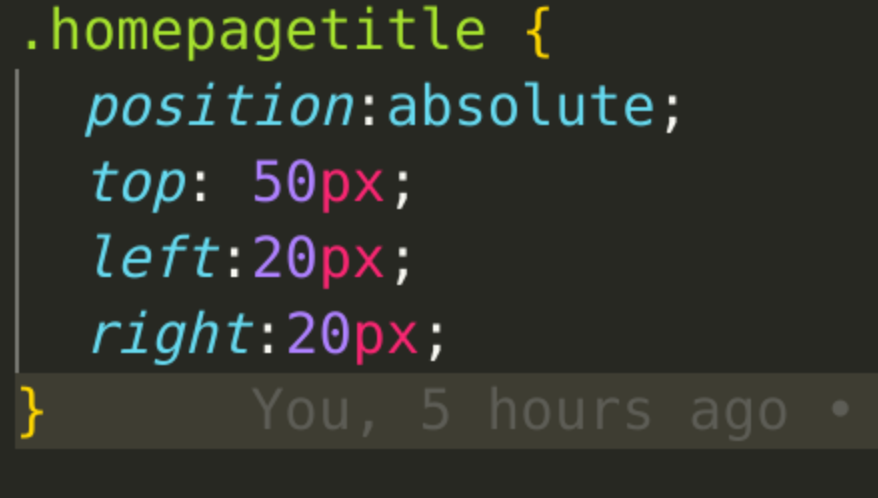
Swish! Here’s the CSS and HTML code if you want to Steal Her Look:

Using fixed positioning makes the placement of your element relative to the whole browser window, aka the viewport. Since that does not change, when you scroll through a window, an element with a fixed position will not move. This is super handy if you want to keep something visible on your page at all times, like a navigation bar or a CTA. But be careful of it getting in the way of other content!
Here’s what happened when I changed the homepage title to a fixed position:
Thanks for reading, hit me UP on Discord!!
Go back to Home